
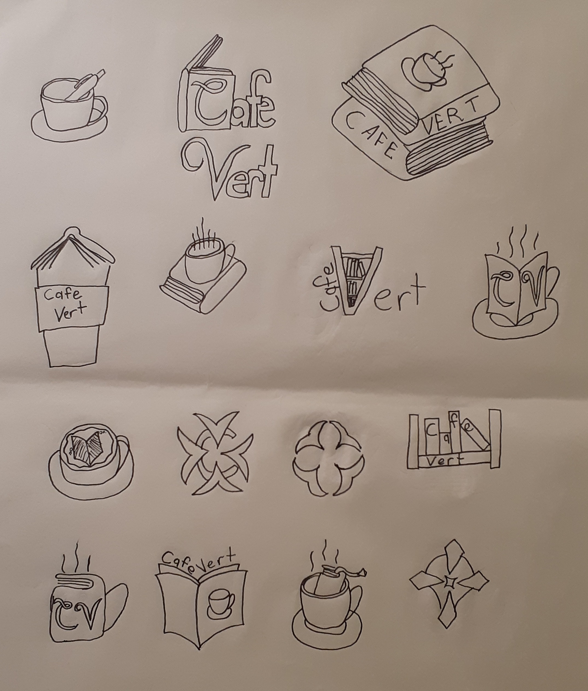
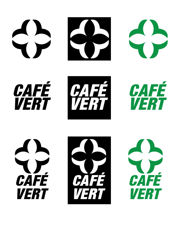
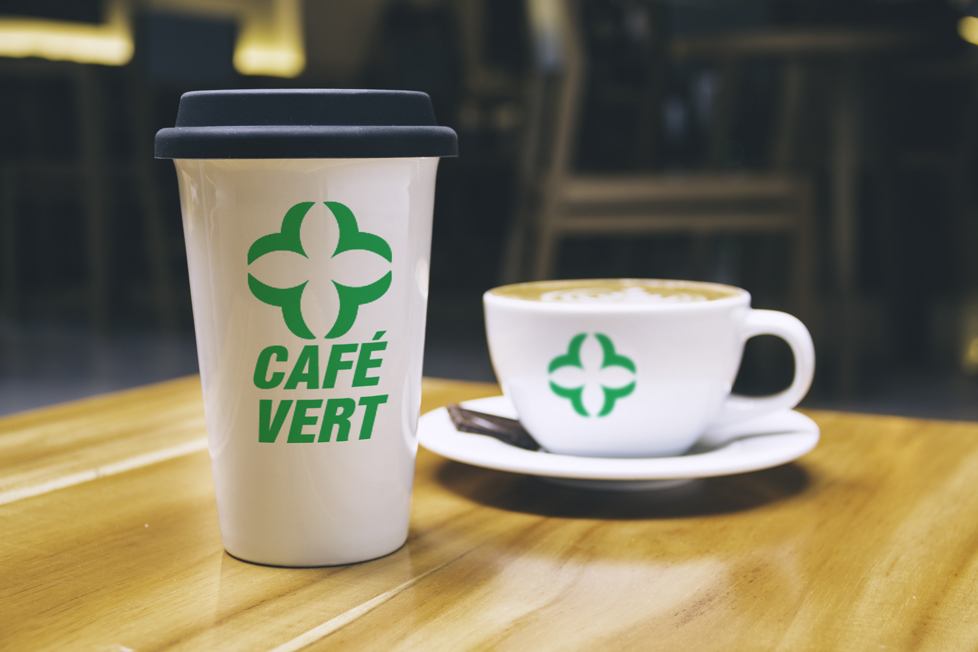
Café Vert
This design is for Café Vert, a locally owned bookstore café. They asked for a new logo design, including an abstract logo, a wordmark, and the two combined. They also wanted a black/white, reversed out, and a full colour version of each logo.
The clients asked that I design with a coffee cup in mind, as all three versions would be placed on the sides of their cups throughout the year. They also asked that it be a simple design that would be easy to recognize at a glance.
Typefaces Used:
Harvest Regular
Colours:
C = 85 M = 10 Y = 100 K = 10
PANTONE P 145-16 C
R = 0 G = 149 B = 68
PANTONE P 145-16 C
R = 0 G = 149 B = 68
Programs Used:
Adobe Illustrator
Adobe Photoshop
Adobe Photoshop
Taurus
Made for Taurus, a clothing label that focuses on bold, eye catching designs. They feature hot colours like red and orange in most of their clothes, and advertise a strong, in-your-face image.
One of their main focuses is confidence and power. They were running an Instagram campaign to inspire people to live a healthy lifestyle. Each picture has an element of orange in it, tying it back to the brands bold colours. Advertisements are sprinkled throughout the campaign, but the main focus is sporting/workout pictures.
Typefaces Used:
Aller Display
Colours:
C = 0 M = 80 Y = 96 K = 2
R = 235 G = 88 B = 38
R = 235 G = 88 B = 38
Programs Used:
Adobe Illustrator
Adobe Photoshop
Adobe Photoshop


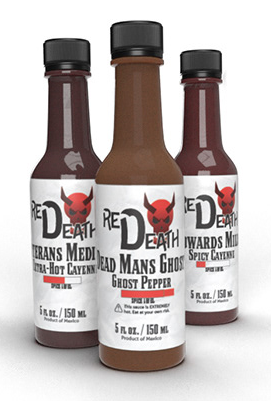
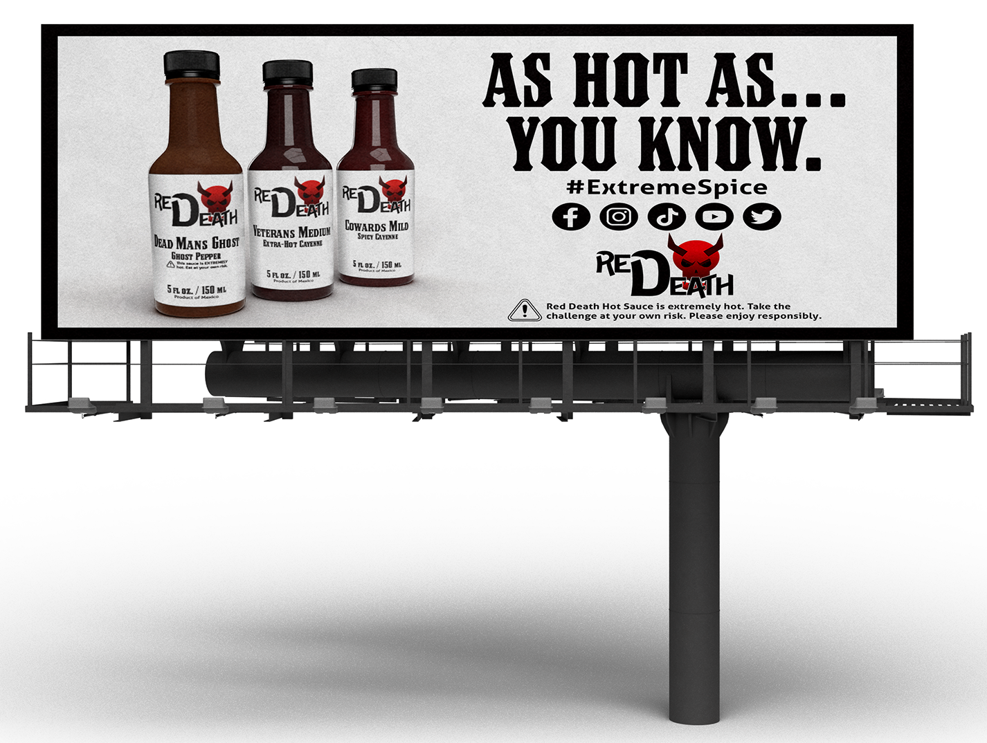
Red Death Hot Sauce
Red Death is a hot sauce brand known for being incredibly spicy and daring marketing strategies. They were looking to rebrand, their signature hot sauce with new labels. The main focus was to keep with their existing hardcore reputation, while simultaneously creating contrast with other brands when placed on a shelf.
To achieve that effect, I used a very blunt, black and white design with red as a highlight. On a shelf full of hot sauce bottles, a white label will stand out, since red is typically the dominant colour used by competitors. Text is set in a very eye-catching typeface with a heavy line weight.
Spot varnish is used to extenuate the flavour of each individual flavour, as well as the spice level. I used a subtle background of crumpled paper to add depth to the design and fit the old fashion feel of the design.
Typefaces Used:
Logo - DeLittle Chromatic
Labels - Council OT Regular
Body Copy - Helvetica Regular
Labels - Council OT Regular
Body Copy - Helvetica Regular
Colours:
Devil Horns
C = 15 M = 100 Y = 90 K = 76
R = 80 G = 0 B = 0
Devil Head
C = 0 M = 100 Y = 100 K = 0
R = 237 G = 28 B = 36
C = 15 M = 100 Y = 90 K = 76
R = 80 G = 0 B = 0
Devil Head
C = 0 M = 100 Y = 100 K = 0
R = 237 G = 28 B = 36
Programs Used:
Adobe Illustrator
Adobe Photoshop
Adobe Dimension
Adobe Photoshop
Adobe Dimension

